Image

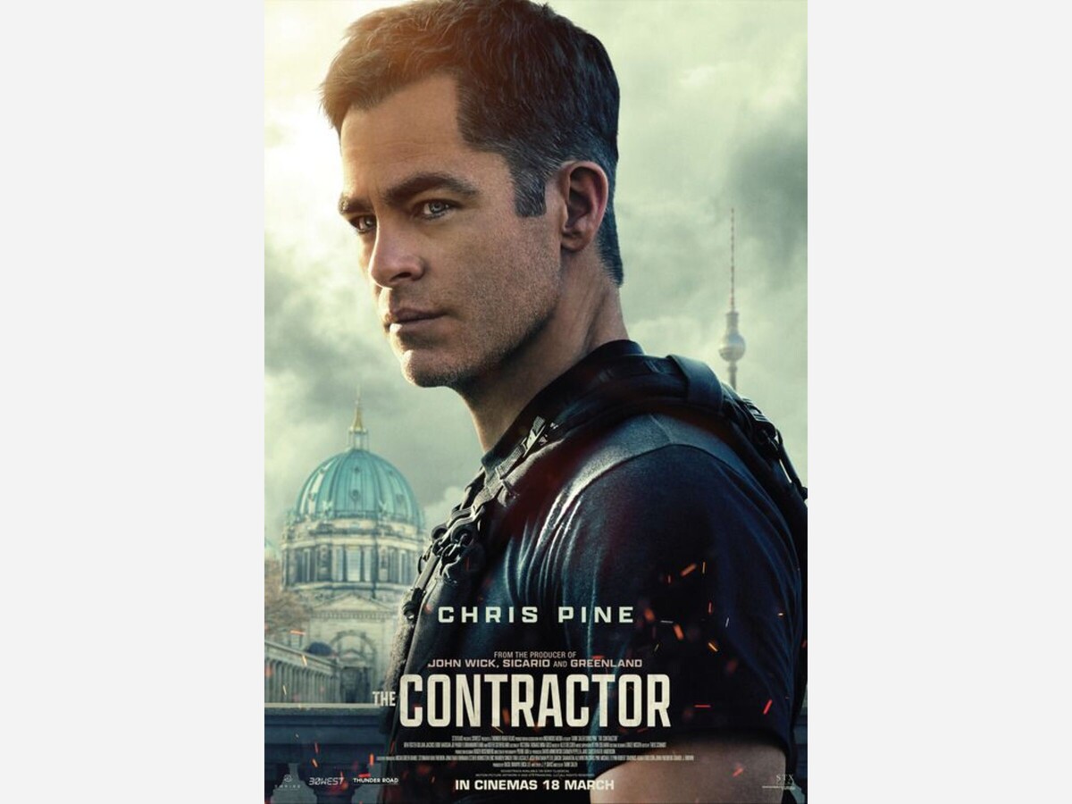
One of the things that gets said a lot around award season about the technical categories is that the average moviegoer only will notice the editing or the cinematography when it is well above average or when it is awful. It is easy to look at a clip from Taken 3 in which there are 15 cuts over the course of six seconds and notice the bad editing, just as it is easy to look at the editing in Birdman or (The Unexpected Virtue of Ignorance) and praise it as outstanding. The Contractor fails in almost every technical category (mostly in cinematography and editing), making it an unwatchable slog.
As an artform, there are very few hard and fast rules that almost universally need to be adhered to in film. That said, the rules that do exist tend to exist for a reason. One of these rules is commonly referred to as the “180 rule.” This rule basically says that if you have two characters talking and a line is drawn connecting the two characters as if they were dots on a paper, the camera should always stay on one side of the line. There have been exceptions to this rule such as in Heat, but there have always been stylistic or thematic reasons for these flips. At a few points in The Contractor, this rule is violated making the scenes visually confusing. Considering the scenes where this is happening are purely expositional dialogue, it is not done for any major reason.
The movie also plays with negative space in frames but not for any thematic or artistic reason, just from poor framing. There is a sequence where the shot is trained on what appears to be an air vent and Chris Pine is laying on a bed but only his legs are visible for no good reason. There is a shot at a funeral where it is a lengthy dialogue scene where the two characters are on the far-left side of the screen leaving a ton of empty space on the right side. There is a scene where Kiefer Sutherland is explaining what the overall mission of the movie is and at one point dialogue is delivered while he is facing away from the camera and at one point, he is at the far left of the screen looking off to the left, leaving the other 75% of the screen empty. These are fundamental issues of cinematography that are distracting to the viewer.
In terms of editing, there is a tonal dissonance between shots, again not for dramatic effect. There are sequences that are heavily scored at parts and then when it cuts to the next location the music is abruptly cut off. The same goes in reverse where music abruptly begins in scenes after not being present in others. There are multiple cuts of Chris Pine walking places as if the movie assumes the audience is unfamiliar with how people transport themselves from place to place. There is a sequence where Chris Pine is conducting surveillance on someone and, as if to communicate the passage of time, they change the weather as he walks between locations which creates the illusion that on one side of the wall is a downpour and on the other side it is a clear night.
As evidenced by the litany of complaints about the technical issues, the movie is basically unwatchable. These issues are all over the movie and consistent enough where they will distract from the plot enough to the point where the plot is completely forgettable. It is not worth watching except as an exorcise for an aspiring filmmaker to see what not to do when making a movie.
Final Rating: 0/10